It's December of 2017 and after reading dozens of articles online and connecting with professionals on LinkedIn, I took the first step to pursue a career in UX Design. I enrolled in a course at Springboard. What followed was a life changing experience that made me fall in love with UX Design as a discipline. It made me a strategic thinker and a champion of user needs while designing a product.
It was also an year when three of my closest friends got married. As a bridesmaid, I was there to make plans, brainstorm ideas and share excitement and worries about their big day. The one thing that always stuck out as a sore thumb during our conversations was wedding shopping. While shopping sounds fun, the lack of choices, media and culture influences ( Indian cinema or Bollywood ) and time constraints were a big issue.
It was really intriguing to see a problem and finding a way to solve it. More so because it involved my love for fashion, styling and South Asian culture. As my Capstone project, I explored the shopping experience of South Asian women living in USA by following a human-centered approach.
While talking to South Asian women living in USA, I found that wedding shopping is a stressful, expensive and time-consuming experience. On top of planning a wedding, brides-to-be spent hundreds of dollars and hours at stores online and offline to build a perfect wedding trousseau.

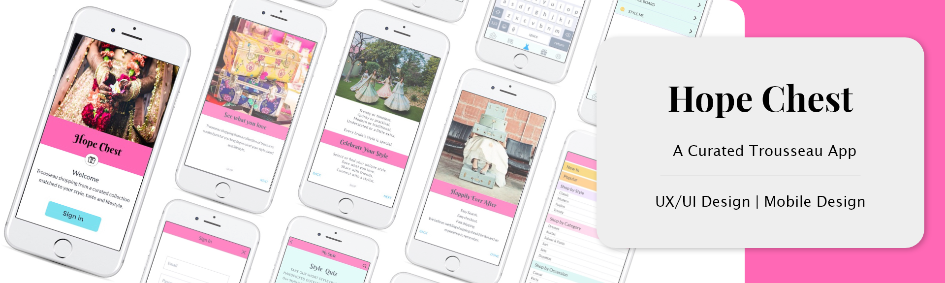
Solution : A Curated Wedding Trousseau Shopping App.
The idea was to create a personalized experience which makes shopping faster, personal and easier for brides-to-be. The goal was to make wedding shopping fun and bring the same attention-to-detail brides need when shopping in physical stores.
The following were some points that were considered while working on the solution:
1. Understand trousseau shopping experience of brides-to-be.
2. Nurture the tradition of bringing beautiful things collected from one part of life to the next.
3. Provide a shopping experience that is seamless, personalized and fun.
Discovery
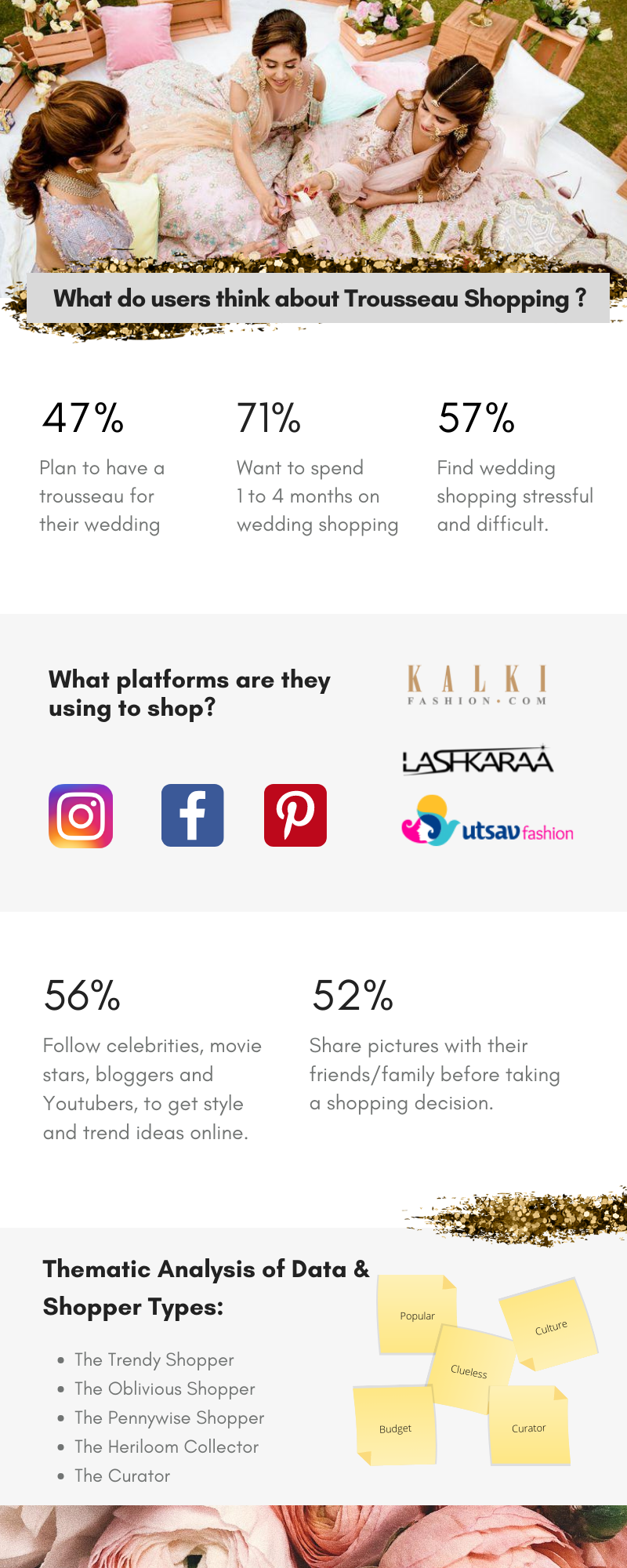
To explore user goals and pain points I conducted user research using a mixed-method approach.
I collected & collated data through a combination of survey research ( created on Google Forms ) with 21 women and video interviews with 5 women between the ages of 21 and 40 years. I found the participants through Instagram and Facebook and did a screener survey first, followed by a wedding shopping survey and interviews. I also did secondary research through online resources to understand the trends in the wedding shopping space in U.S.A.. On the basis of the research, I found the common trends in wedding and online shopping.
Coming from a background in Behavioral Research, it was exciting to see insights becoming a starting point of crafting solutions. While working in an academic setting, the real life impact of research results took time. In a UX Design process I found the right pace where user research formed a solid foundation of the entire product. I liked how I was able to find actionable insights
Empathy Maps & User Personas
In order to understand the users I made Empathy Maps that explained what these users 'See, Feel, Think and Do'. This acted as a great starting point to build User Personas for the app. It gave me a better understanding of the user behaviors, pain points and motivations. This helped in creating user journeys for individual personas which ultimately led to choosing features for the MVP.
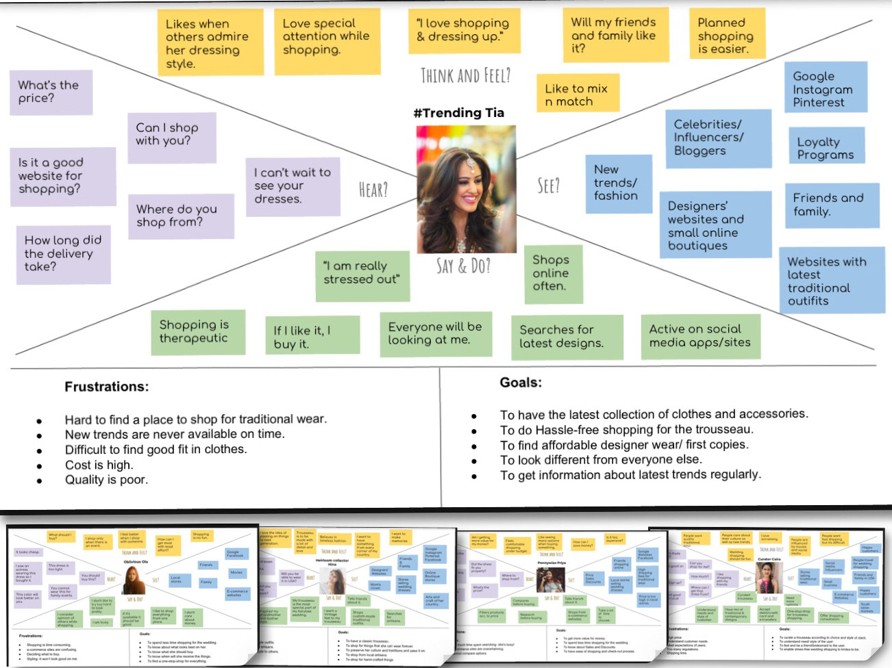
Empathy Maps


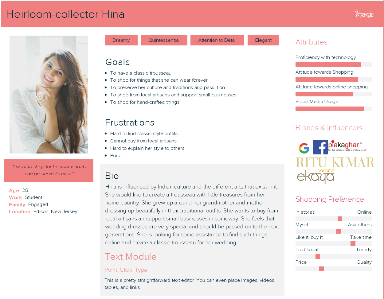
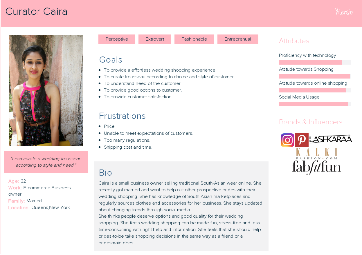
User Personas
Define & Ideate
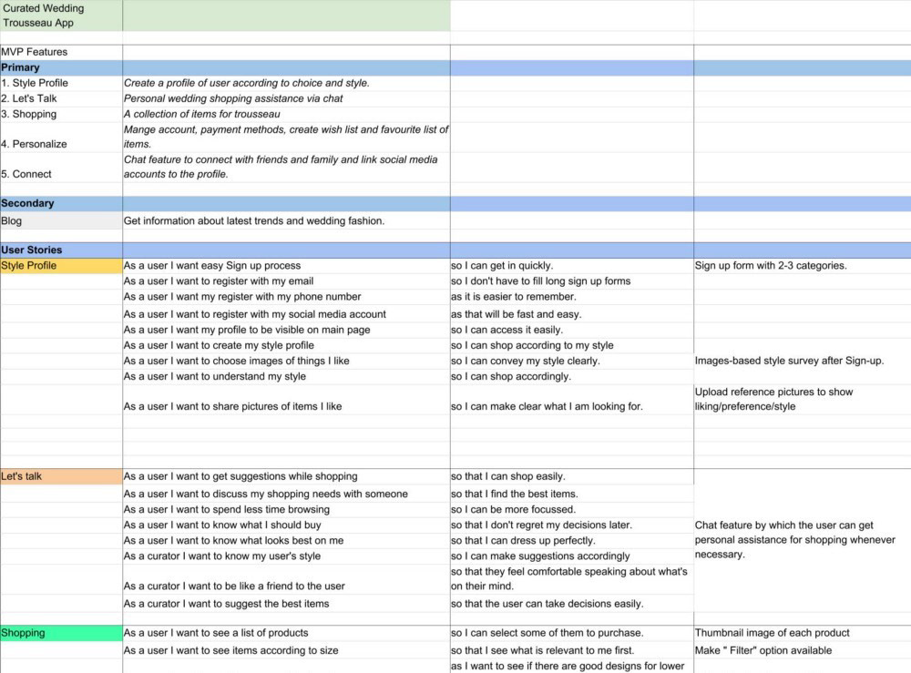
User Stories & MVP
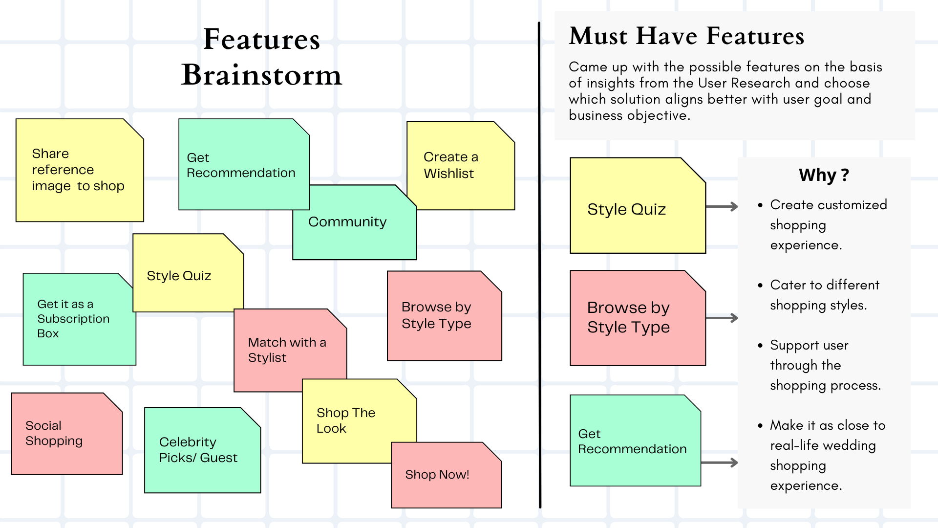
This step was crucial in finalizing the main features that the App will have in order to be most usable and useful for users. My MVP had five Primary features and one secondary feature based on the User Research done earlier in the process. The User Stories are useful to find out what specific actions the users are trying to accomplish and it helped in finding sub- features that will make way for the user personas to achieve their goals while doing wedding shopping. These features were then tested in the the next step.
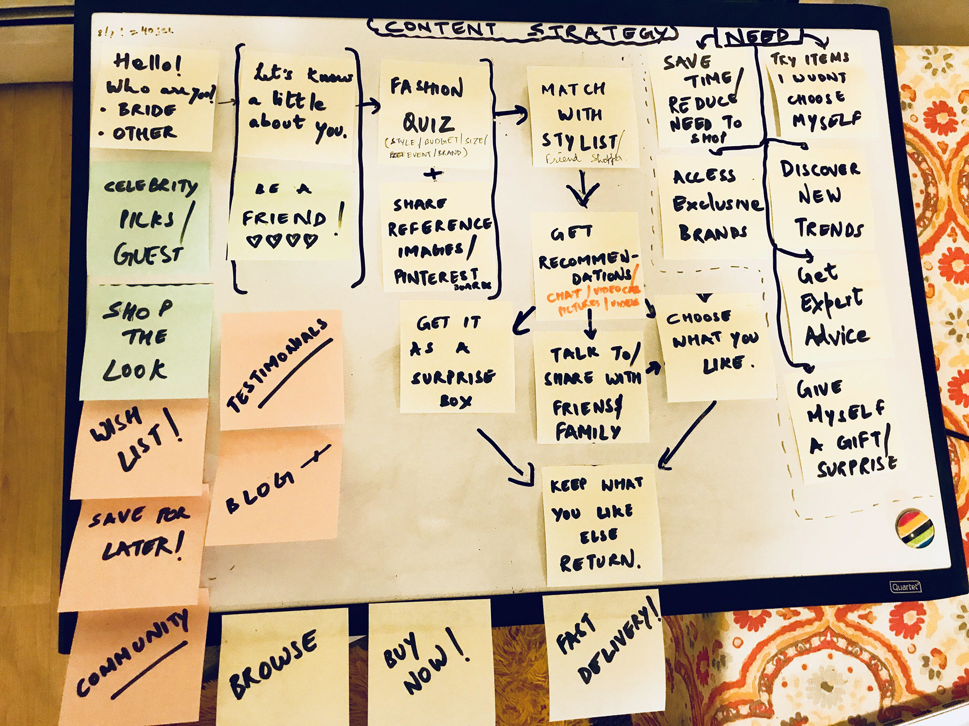
Content Strategy
The content strategy process started on the basis of the user research, competitive analysis and the user stories. The general flow and logical steps in the whole process of shopping for a trousseau were thought about and written down on a whiteboard. The essential features that are present in most curated shopping websites were also noted down. This was just a first step in putting down everything that is out there in front of my eyes so that I can keep what fits the need of the users and remove what is not important at this point.
A Card Sort was also conducted using This helped to investigate if the main features and sub-features associated with the various User Stories really fit into those categories.
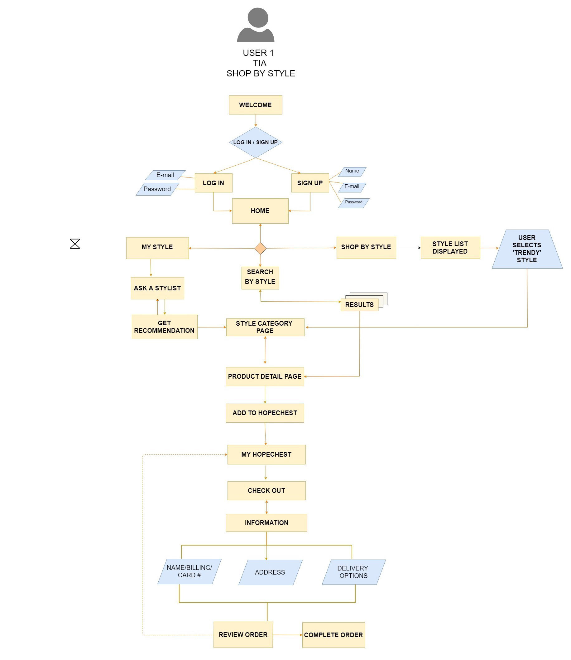
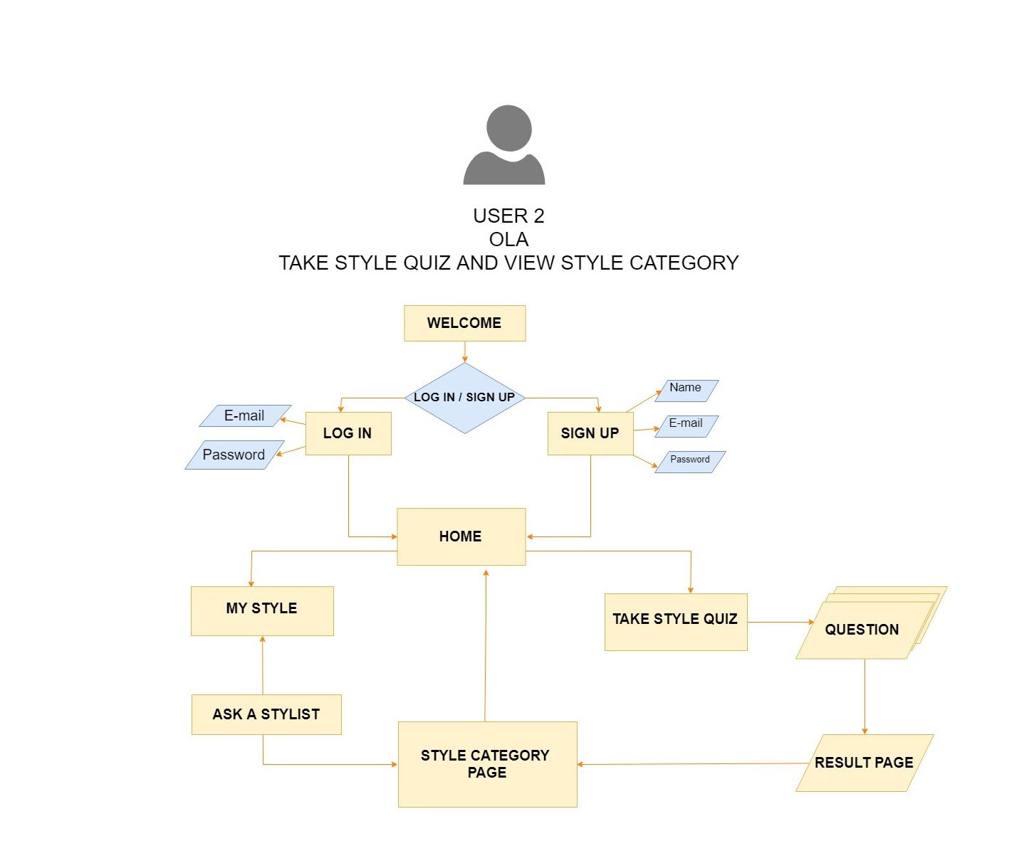
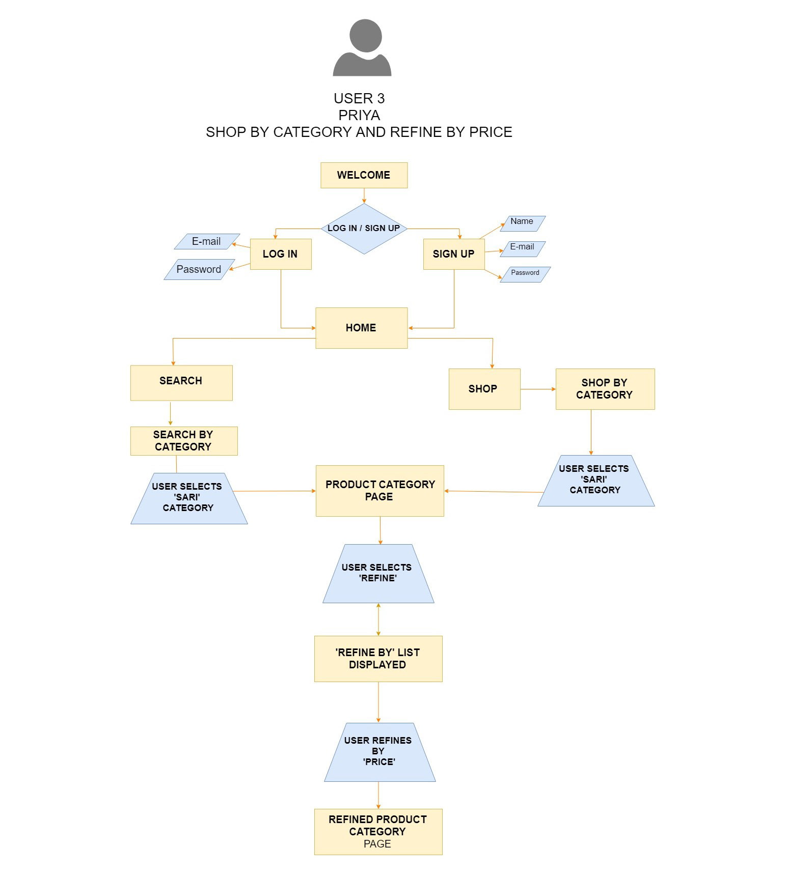
User Flows
User scenarios and designing the user flows helped in providing information about how the various user personas will go about doing tasks on the App. User research helped in deciding what will be most important goals for each persona.
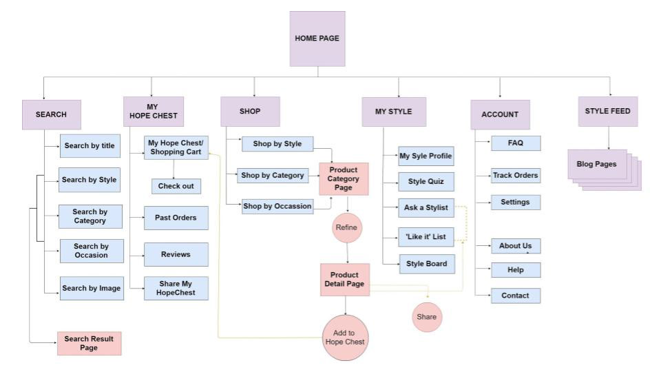
Site Map
After finalizing the main features for the MVP, the Information Architecture of the App started coming into shape. The Site Map was created keeping in mind the basic features and how they will appear as screens and in what order. By constantly doing iterations and keeping in mind the user flows the Site Map was finalized.
Wireframing
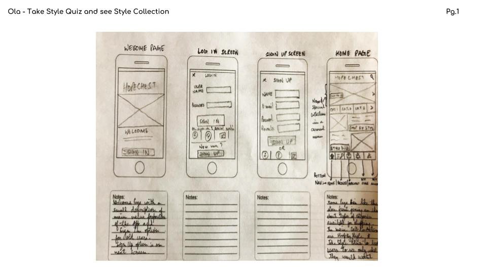
This process started with making low-fidelity sketches on paper. It was easy to visualize screen layouts, positioning of features, navigation and the flow of the various elements. It also enabled to make changes constantly with feedback from people. Sketching made the product come to life.

After some iterations and getting confident about the wireframes on paper it was time to create digital version of the wireframes. For this I created mid-fidelity wireframes on Balsamiq. While sketching was a quick process, wireframing using a software took a long time but it gave an idea of how the design will look on a real screen. It gave me a chance to think through the user flows and how to come up with the best possible way to achieve them through design. It was challenging but helped me to constantly iterate and refine my project.
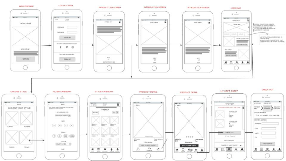
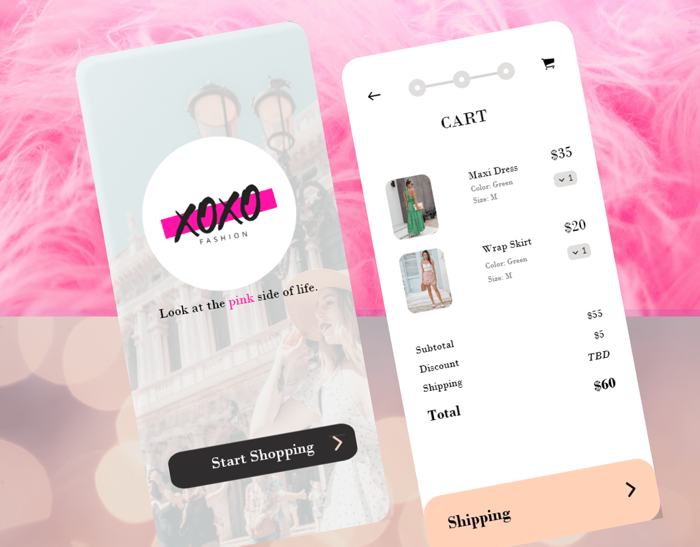
First Time User: Onboarding & Shop By Style
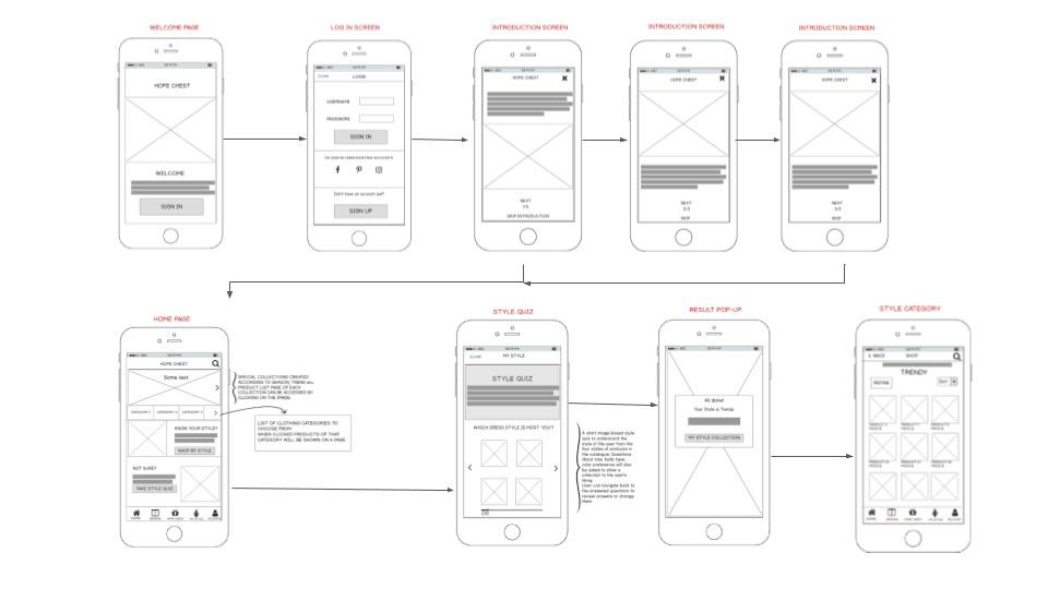
Returning User : Sign in & Take Style Quiz
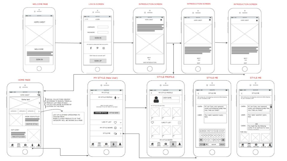
First Time User: My Style Feature
Prototyping & Implementation
After designing and testing the wireframes, it was time to create a high fidelity clickable prototype of the design. The prototype was built using Marvel App. It was interesting because it was a faster step and I could visualize how the final product will look like. In order to see if the future users feel that too, user testing was done to gain insights about the product and how users interact with the application.
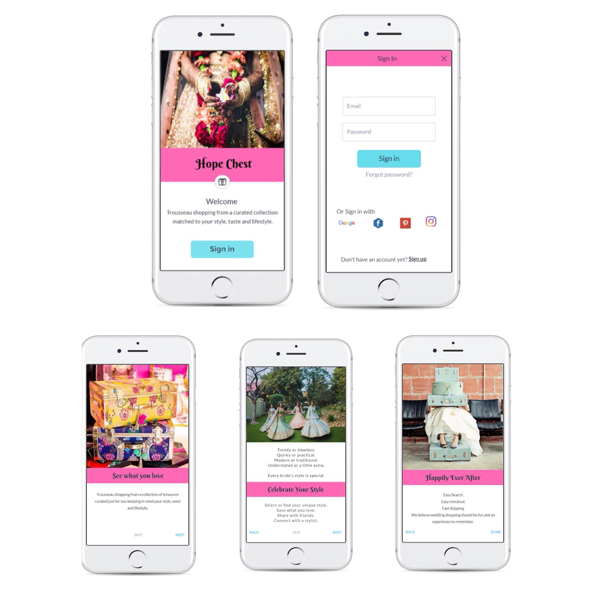
Hi-fidelity Wireframes of On-boarding Process
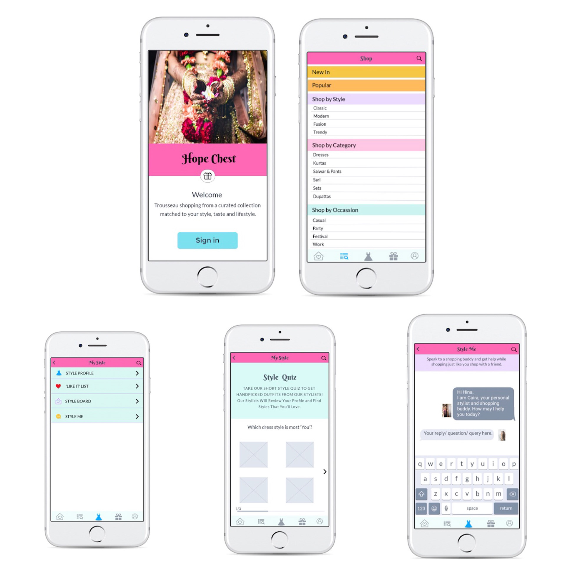
High-fidelity Wireframes
Clockwise from top-left: Home screen of Application Category Page, My Style Page, Style Quiz Page & Style Me Page.
The main actions that I investigated through user testing were:
1. Would users be able to navigate back to the Homepage from anywhere in the App? How will an iphone user perform the task?
2. Will users be able to take the Style Quiz and the pagination on the result screen be close to user’s expectations?
3. Will users be able to browse and shop by style and category?
4. Will the users understand that Shopping Cart is named Hope Chest in the App?
5. Will they be able to see what they have put in their Hope Chest and checkout?
6. Will the user be able to understand and use the icons of the bottom navigation?
After user testing it was clear that the design of the App is intuitive at best, call-to-action buttons stand out and the flow that was intended actually works.
There were some minor issues such as tapping issues because of closeness of icons and buttons. The size of the bottom navigation icons was also reported to be too small and not visible because of low contrast between icon color and the background. The shape of buttons were reported to be looking more like labels. The font size is too small in some places. Some back buttons were not visible in some places due to low contrast. I further intend to test another version of the prototype to get a better understanding other flows in the App also.
Final Thoughts
As my first UX Design project I learned that the process of User Experience Design is continuous and collaborative. Every time I got stuck I brought in users' perspective by talking to them or sharing my ideas in form of wireframes and mockups with them. Brainstorming with my classmates, mentor and bringing a different perspective helped a lot in developing better solutions.
I learned that mistakes become learning and testing and iterations are crucial to any design process. It’s always best to understand the user’s perspective rather than making assumptions. To do that it is necessary to listen and keep an open mind.
The biggest learning for me though was understanding UX Design in action. Many times I got too involved in how the app 'looked' or the UI Design part but as a UX Designer it is more important to understand the purpose of design decisions.
By understanding the main motive of the users to save time and lessen the stress related to trousseau shopping, focus was on designing a product focused on those needs. The idea started with putting the fun back and stress away from a really special time of a woman’s life. But this project taught me that it is not just to create a happy path but to create a happily ever after!
Tools Used: