Norwalk Dental Care is a private dental practice based out of Norwalk, Connecticut, newly acquired by my client in 2018. The practice had been in the area since the early 80's with most patients aged 60 years and older now. The client had experience and services ranging from family dentistry, where the dental needs of the whole family can be taken care of to more specific services like restorative and cosmetic dentistry.
They felt a need to expand their patient base and reach out to a broader range of people who can turn into future patients, through improving their online presence.
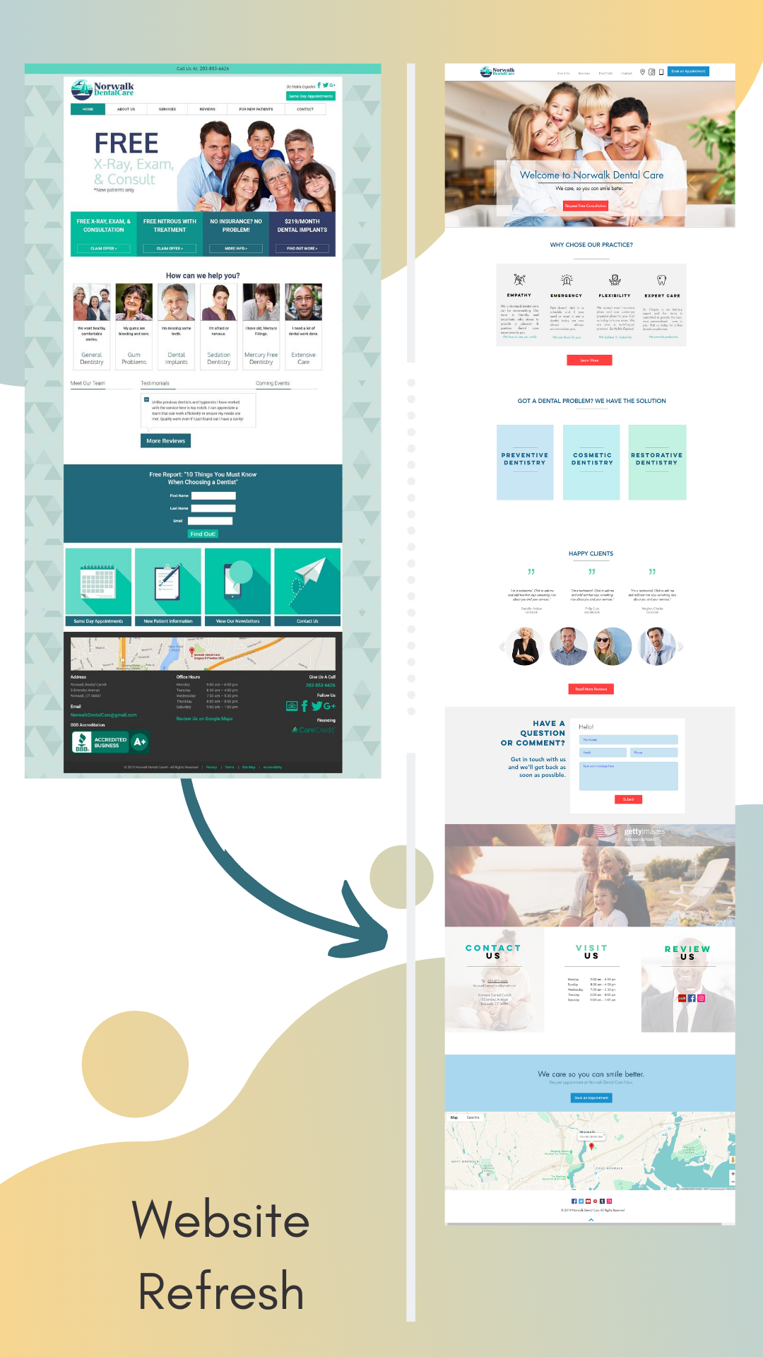
The client wanted a redesign of the website as it 'looked' outdated, with poor visual design and low engagement rates.
The Goal :
1. To improve the current website's UX, navigation and UI.
2. Improve traffic, user retention and attract new clients.
This included :
1. To create functionalities that will enhance the user's end-to-end dental practice experience.
2. Test the current website and see what's working and what are the problem areas.
3. Update/change content of the website on the home page and other pages of website.
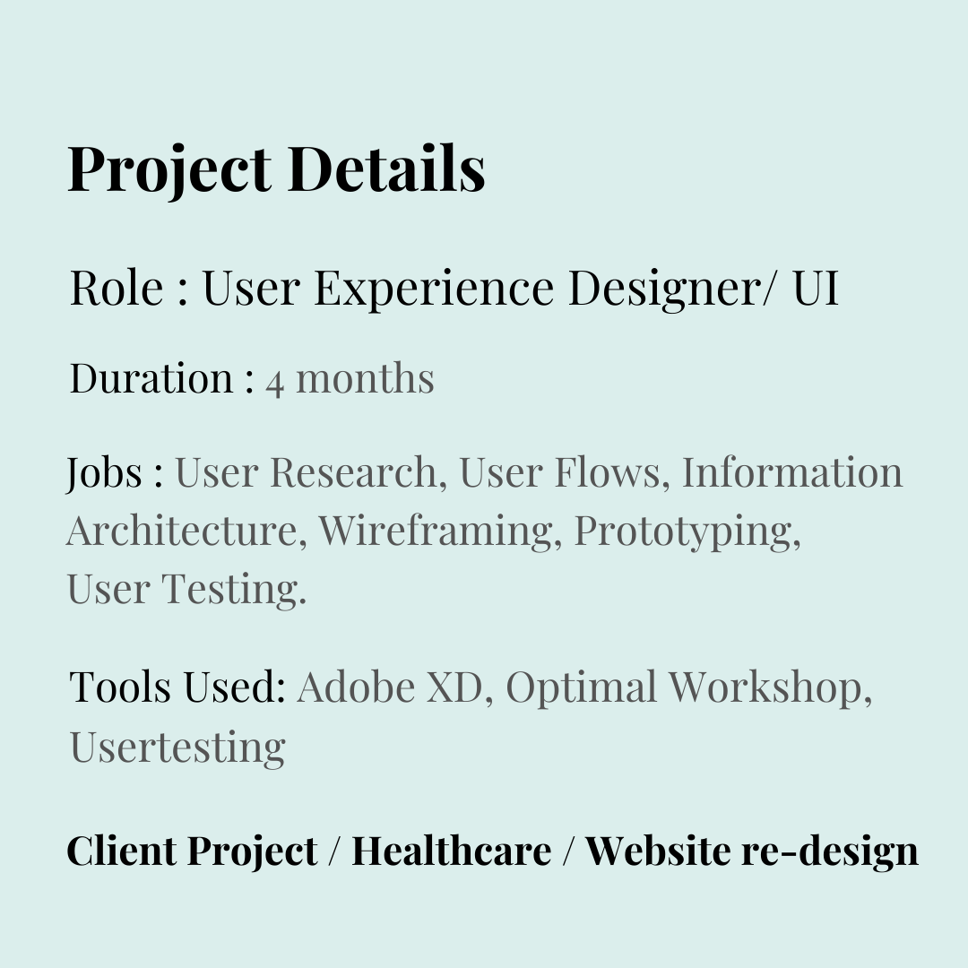
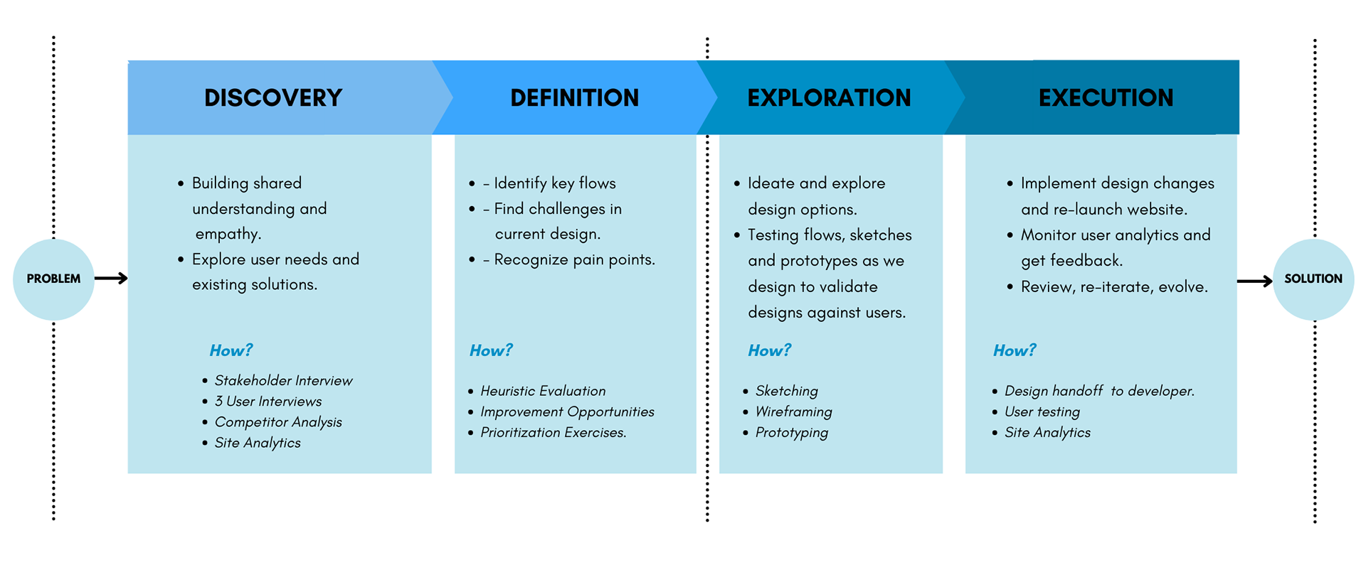
My Design Process
For the website refresh I used a "double-diamond" process which includes intervals of divergent thinking in the Discovery and Explorations stages and converging data and ideas during Definition and Execution stages. It's a constant learning process, where insights are turned into UX deliverables and through prioritization exercises, certain design features and solutions are chosen, fleshed out in forms of sketches, wireframes and prototypes and tested with users to validate those solutions.
Stakeholder Interview
In the first few meetings, some questions that I explored with the client were as follows:
-Why do you want to redesign the website?
-What are the major goals behind the redesign?
-What function is the website providing now?
-What sets you apart from your competitors?
-Do you have a niche?
-Who is your client ?
-Main call to action ( eg, Call Now, Same Day Appointment etc.)
I also explored the role, they see the website playing, in their practice and business and the timeline of the project.
User Interviews
Next, I did an evaluation of the current website to learn about the user's goals, challenges, motivations, and the context in which they use your website. As there was a time and budget constraint, the research methodology I chose was in-person interviews. For this 4 individuals between the age-group of 21-45 years of age, living in the state of CT were recruited.
1. The idea was to understand when, how and why do they use healthcare providers' website.
2. What do they like most about the current website and why ?
3. What do they dislike the most about the website and why ?
Insights from User Interviews
" It's difficult to choose from so many dental practices in the area, so I go where my family goes."
" I don't have dental insurance so I cannot see a dentist."
" I want to make an appointment online quickly and easily as I am always busy with work and my kids."
" I want to fix my teeth, but I'm so scared to go to a dentist."
" I love that there is an option of free consultation here."
" This looks very outdated and the pictures on the website look so fake and clinical."
Competitor Analysis
I reviewed 4 websites of dental practices in the area. It gave an idea of industry best practices and the current trends in responsive web design at the time. For this heuristic analysis of four websites of Dental practices was done. Some features that made them stand out were:
- Clear ‘Call To Action’ buttons.
- Good color contrast and optimum white space.
- Clear navigation options between various pages.
- Clear organization of content and information on the website.
- Use of high-quality images that are relatable and warm.
- Use of friendly language.
- Visible and consistent social media presence.

User Stories
User stories were used as the prioritization exercise. It tells the jobs to be done, the user's motivation and expectation as well. This helped to identify the main Call to Actions and features that work and that need to be added in the refresh.
The following were some user stories:
“As a user, I would like to make an appointment easily.” - Main CTA
“As a user, I would like to find location of the practice easily.” - Map, Prompt to Open in a navigation app
“As a user, I would like to get same day appointment in case of emergency.” - Secondary CTA
“As a new user, I would like to know more about Invisalign.” - Services Page, Book Consultation
“As a new user, I would like to know what others feel about this dental practice.” - Reviews, Testimonials
“As a new user, I would like a smooth and easy first visit.” - First Visit Page
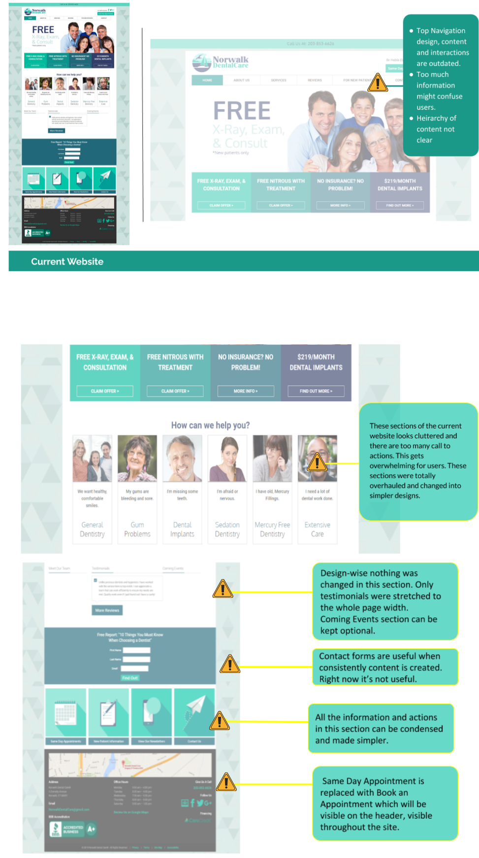
Identify Key Problem Areas
In order to better review the current design and to identify key problem areas, a heuristic analysis of the current website was done.
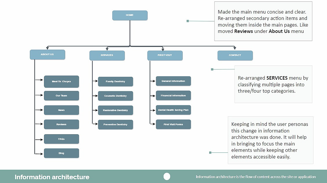
Information Architecture & Site Map
At first look, some changes were identified in the site map of the existing website that could be re-arranged. After sharing insights with the client, I did card-sorting exercises with 6 subjects using Optimal Workshop.
Magic is not just in the solution. But real magic is in each step, which together led to the final refresh of the website. I made UI Design changes, and added visual design elements to make the website more user-centered and intuitive while also looking more clean and modern. I made sure to create a responsive website design that is adaptable to both desktop and mobile devices.
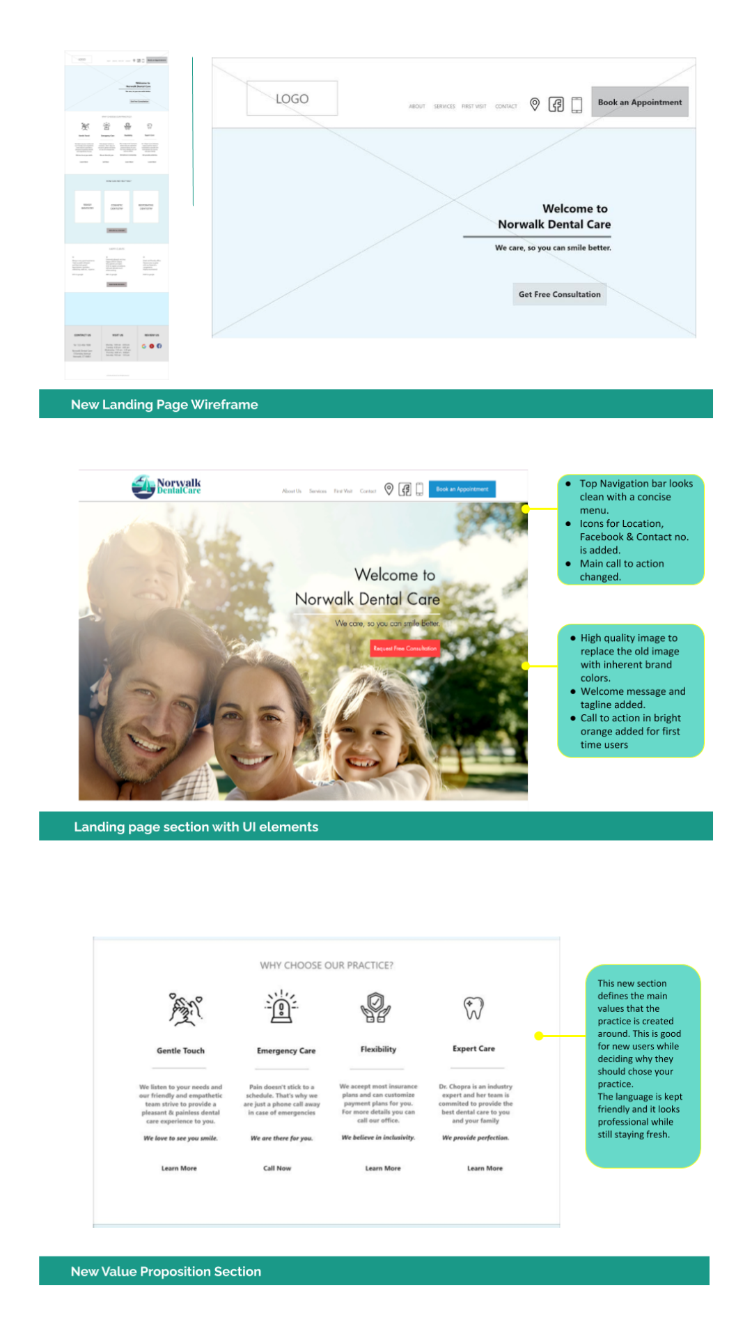
Wireframing & Prototyping
I drew sketches of key functionalities, tested with 3 users and re-iterated on them.
Following are the low and high fidelity wireframes of the Home Page which became the starting point of the re-design. The main and inner pages were also designed accordingly.

The new design of the website was approved, implemented and launched.
The final website can be viewed here.
Key Takeaways :
1. User Experience precedes the "look and feel" of a product.
2. Communicating clearly with clients is most important. Listening carefully, robust documentation, setting clear expectations of deliverables and timelines are all vital in a good working relationship.
3. Feedback is key to improve your UX process. As I was the only designer in the project, I would often bring in friends who work as developers or marketing professionals to get their feedback on the design. It gave me a different perspective and told the user side of the story.