Introduction
Tanned & How is a virtual community for those who like to travel, explore and see for themselves. It's all about less rules, free-spirit and making travel plans centered around lasting experiences. My client has a good social media presence on Instagram and Facebook. They were planning to develop a website of their travel stories, and wanted to make it more user-centered.
The main goal of the project was to understand the users and design a website in order to improve engagement.
The solution was helping people plan affordable and experience-based travel through sharing personal travel stories.
Right from doing the user research and the user flows, developing the Information Architecture and to conducting user testing, every mistake became an insight and a place for learning and iterations which brought me a step closer to the final design. Below is a summary of all the steps that were taken to develop Tanned & How website.
User Research
The demographics and trends of travel websites were studied by doing research online and studying analytics of client's existing social media. Survey and in-depth interviews were done to understand the why's and how's. Respondents were from India and were approached through social media platforms like Facebook and Instagram. Some great insights were found on the basis of responses from 55 people.

With the increase in income and development of mobile technology, people have more time, flexible work schedules and disposable income that they prefer to use on travelling. Global travel trends are noticeably changing as people tend to make longer and more in-depth journeys, arrange solo trips, and explore places like locals. It was found that 1 in 5 travelers admit to visiting a place just because they saw it on some social media platform. Therefore users look for not just basic information about a destination but also want to know about experiences that are unique to that place.
The results from user research was helpful in building user personas, user flows and the information architecture of the travel blog.
Competitive Analysis
In the next step competitive analysis was done of other travel websites that are popular and focus on exploration and free-spirited travel. Two websites that were used in this process were theblondeaborad.com and danflyingsolo.com.

VISIBILITY OF SYSTEM STATUS: After a thorough heuristic analysis it can be said that the two websites rank high on visibility of system status. The users always know where they are in the website and what actions are possible at every step. The landing pages have good content and clear categories for exhaustive information on the blog website
.
USER CONTROL AND FREEDOM: theblondeabroad.com has many ways to browse destinations. There is drop down menu, a map, a search feature and a list of destinations to choose from. The presence of top navigation on every page is another great way users get freedom to explore a website. danflyingsolo.com has more simple categories and a user coming there for both information and exploration will find it easy to navigate through the content.
MATCH BETWEEN SYSTEM AND THE REAL WORLD: Both Websites rank high on this heuristic also. The design of theblondeabroad.com looks like scrapbook with pictures and text spread out unevenly. this gives the whole website a very young and nostalgic feel to it. danflyingsolo.com on the other hand has rational categories and great photographs through which it feels like you are actually travelling to those paces yourself.
It was interesting to see how the two blog websites have included the various user needs into the structure and type of content.
User Personas
On the basis of the user research the following two personas emerged as the main users of the site. The two personas have their own set of travel values, goals and frustrations. The design of the website should be able to focus on the goals and travel values in order to enhance their web experience.

Prioritization Exercises
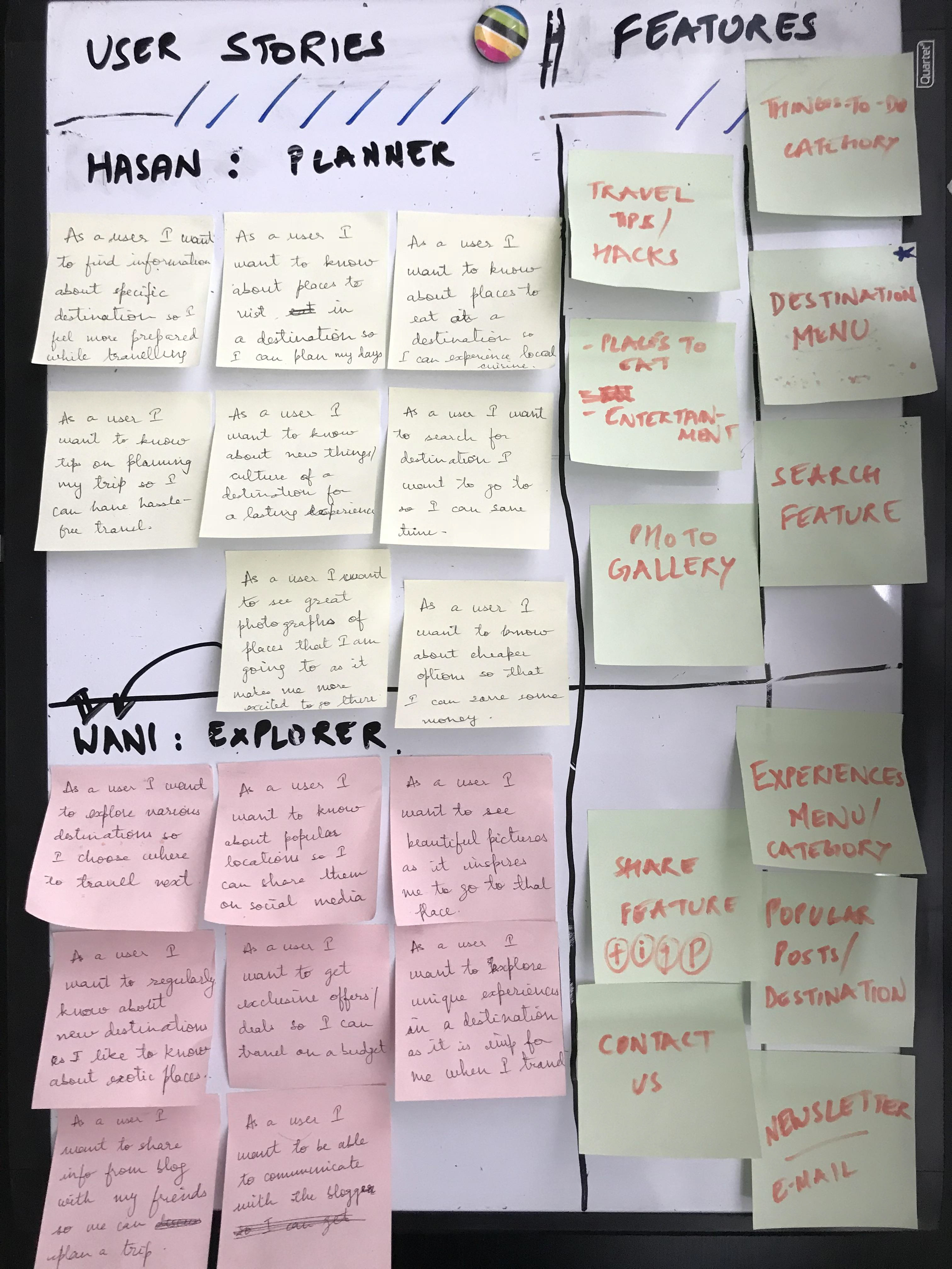
Prioritization exercises are great to explore content for the website and create MVP or the minimum viable product. In this direction, user stories helps building a narrative of what a user did in time. We can then meet the user through features that will meet the needs of the user at every step.
The main questions I asked while writing the user stories were:
1. How they find out about the site?
2. How they engage with content on the site?
3. What makes them come back to the site and refer it to others?
User Stories
Another way of requirement gathering can be done with statement starting with "As a user I want to..." and on the basis of the requirements certain features are selected which will meet the needs of the users coming to the site.
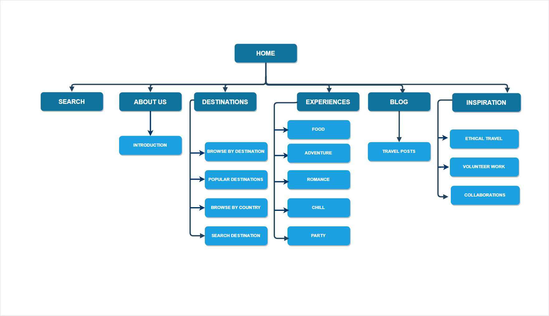
Site Map
On the basis of user research the top categories were finalized and secondary features were moved into sub-categories. This helped in creating a site map and how and where content can be placed in the site.
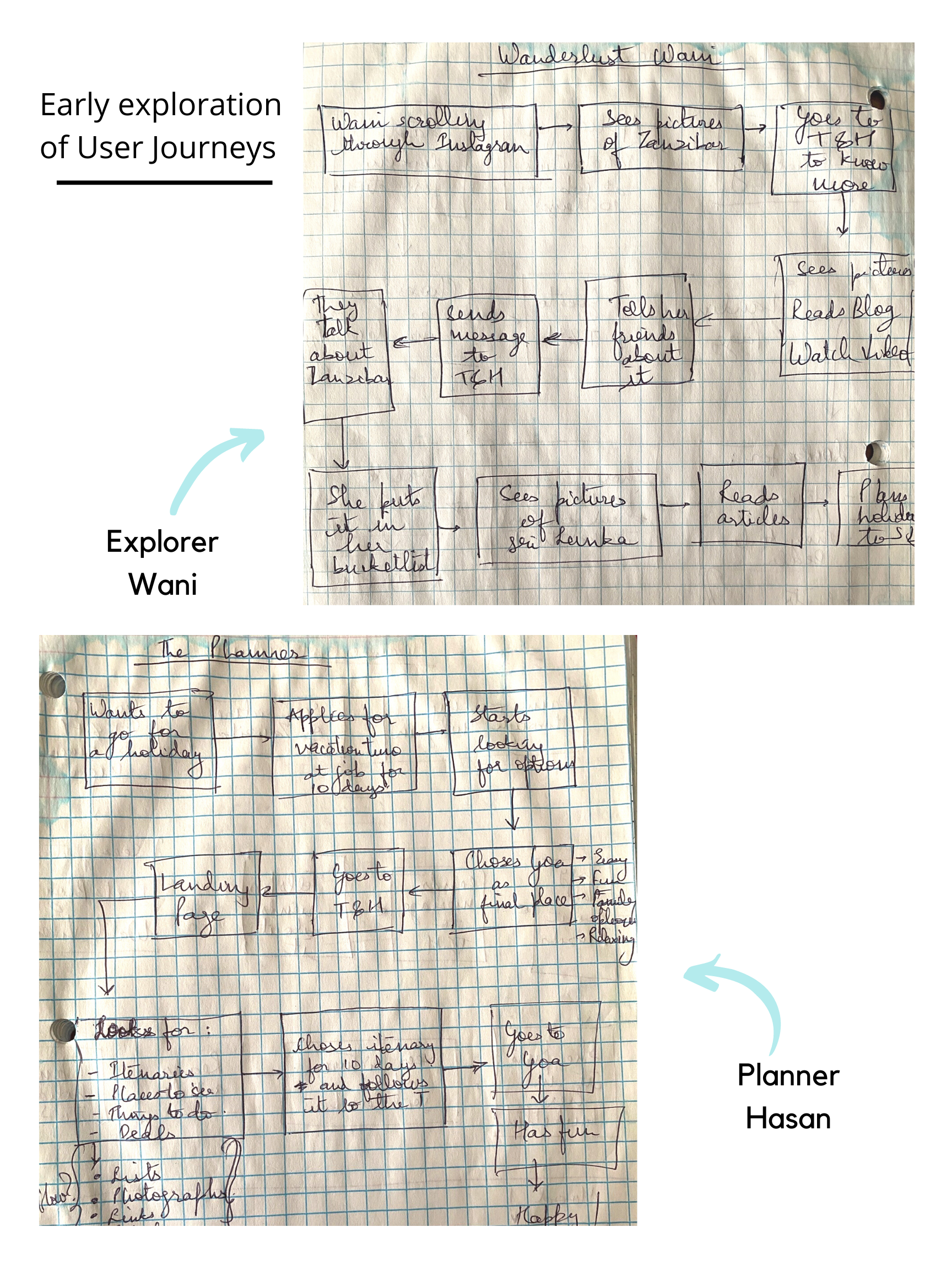
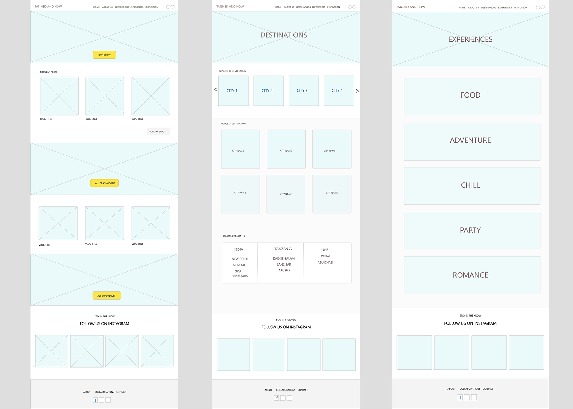
Wireframing
The following wireframes were created of the landing page and other important pages of the site. On the basis of these wireframes the final website was designed. The content was laid out in a manner that corresponded with the user journeys.
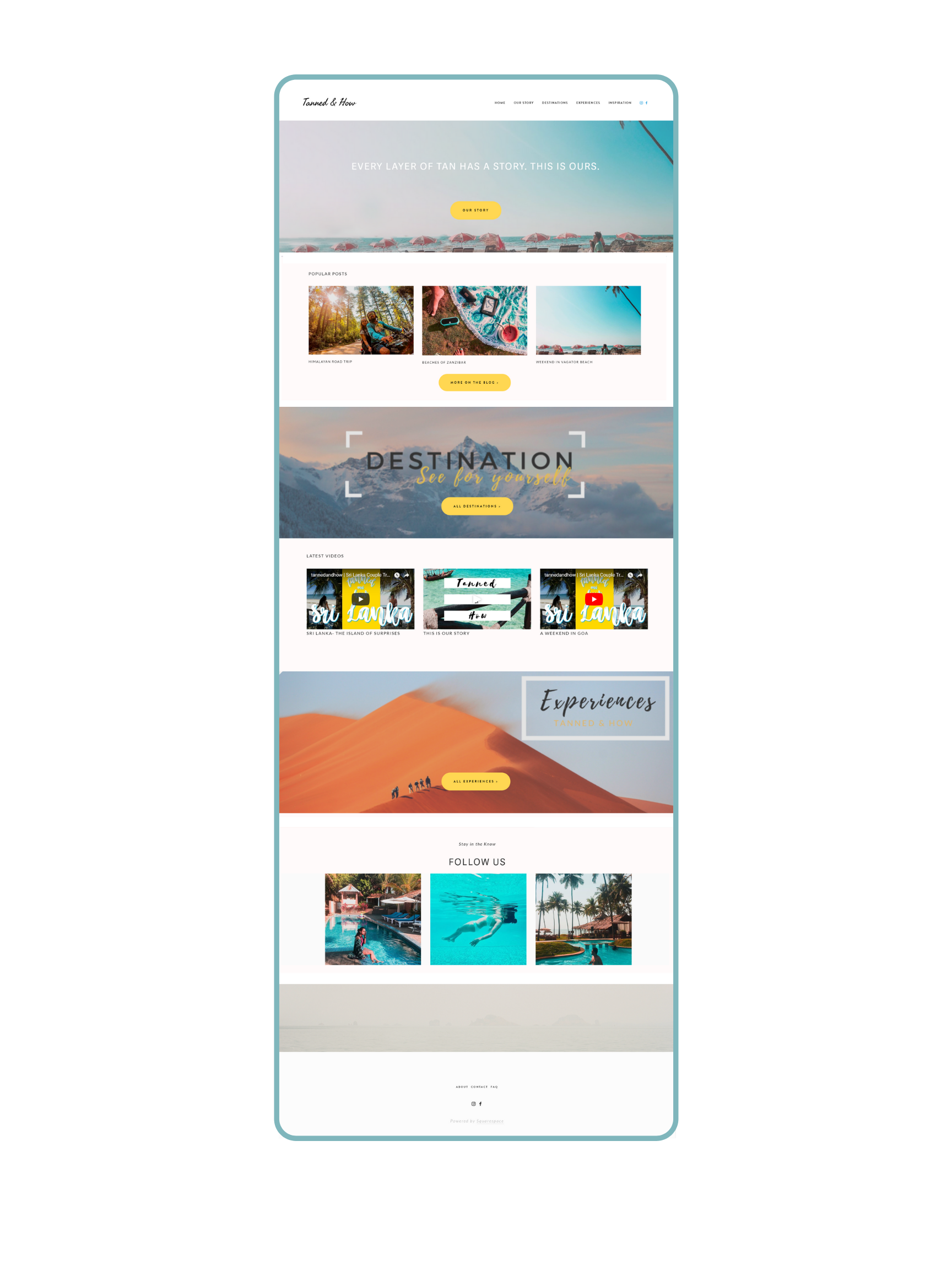
Final Website
The final website was developed and launched. There were two main journeys that were explored in this design.
1. For Explorers : Through studying the design systems of other travel websites, I established a set of guidelines to highlight new and popular content that will result in high engagement. The language used is casual and friendly. The visual design elements are kept simple in correspondence to the logo and brand colors. Use of high resolution pictures and videos made it attractive to explorers.
2. For Planners : To make sure the website is providing 'right information' at the 'right time', I made sure to focus on the content strategy and hierarchy of elements. For existing followers coming from Instagram and Facebook, the website has answers to their common questions about itenararies, budget travel and popular destinations traveled. This is through a combination of blog articles as well as videos.
The brand saw a significant increase in engagement on other social media platforms, high CTR and repeat usage.
Click here to view the website.

Learnings:
It is okay to be scared: Fresh out of my UX Design Course at Sprinboard it was quite exciting and challenging to do this project. From the first meeting with the clients to the launch, there were many milestones I crossed using my multi-disciplinary knowledge and design thinking. Beyond my comfort zone, I found a place of deeper learning, all while taking ownership of my design process.
Design is dynamic: My mentor often told me to just start doing something; talking to people, sketching, lo-fi wireframing etc. and solutions will come up automatically. I learned this first hand in this project. I learned that design is flexible, fluid and keeps evolving. The best solutions emerge by involving other stakeholders in the process.
Tools Used :